Page 331
Reading Graphics
Did you know that one of the first forms of writing used pictures instead of words? Five thousand years ago, Egyptian children learned by reading a kind of picture writing called hieroglyphics:


Native American tribes also used picture writing to “talk” to other tribes that didn’t speak their language. That’s one useful thing about simple pictures—they mean the same thing to everybody. “Bear” is oso in Spanish, ours in French, and honaw in Hopi, but everybody understands . . .
What’s Ahead
WE 332
Page 332
Symbols
The drawings used in picture writing are called “symbols.” A symbol is a simple picture or drawing that stands for something else.
Picture Symbols 🟪 It’s easy to tell what a symbol means when it looks just like the thing it stands for.
 © Thoughtful Learning 2024
Signs and Symbols 🟪 Sometimes symbols stand for things that you can’t really draw a picture of—like the equal sign. In this case, the symbol stands for an idea; everybody who knows basic math knows that = means “equals.” Here are a few examples of signs and symbols used in different subjects. How many do you know?
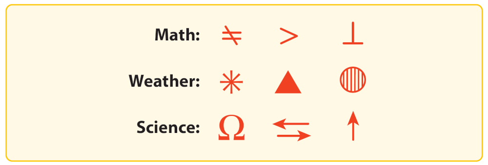 © Thoughtful Learning 2024
Note If you see a symbol and you don’t know what it means, look for “Signs and Symbols” in the table of contents of your dictionary.


Note If you see a symbol and you don’t know what it means, look for “Signs and Symbols” in the table of contents of your dictionary.
WE 333
Page 333
Diagrams
Diagrams are simple pictures that usually include words (labels). Diagrams can show everything from the parts in your computer to the bones in your hand.

Cycle Diagram 🟪 A cycle diagram shows how something happens over time. It shows a series of events that happen over and over again, leading back to the beginning.
Line Diagram 🟪 A line diagram helps you see how one thing fits in among other things; for example, how a certain animal fits into a group of animals.
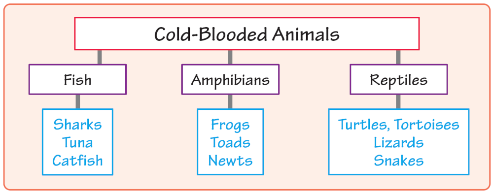

Picture Diagram 🟪 A picture diagram uses drawings to show how something is put together, how parts relate to one another, or how the thing works.
WE 334
Page 334
Graphs
Graphs share information about how things change over time or about how things compare to one another. They give you a picture related to the words on a page. They also help you see information “at a glance.” There are different kinds of graphs for different kinds of information. There are bar graphs, line graphs, and pie graphs.
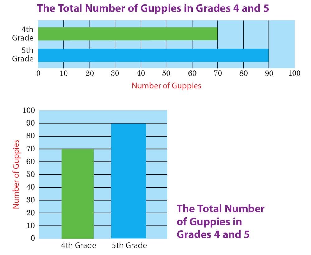
Bar Graph 🟪 A bar graph compares two or more things at one point in time—like a snapshot. The bars of the graph can go up and down or sideways. Both bar graphs below compare the number of guppies in the 4th-grade aquarium to the number in the 5th-grade aquarium at the end of the school year.
WE 335
Page 335
Line Graph 🟪 A line graph is drawn on a “grid.” The horizontal (left-to-right) side of the grid shows time passing. The vertical (top-to-bottom) side shows the subject of the graph. The line drawn through the grid lets you see the subject as it passes through time.
The line graph below shows how many guppies were in the 5th-grade aquarium in each month of the school year. “Number of guppies” is the subject of this graph, and time is measured in months (September through June).
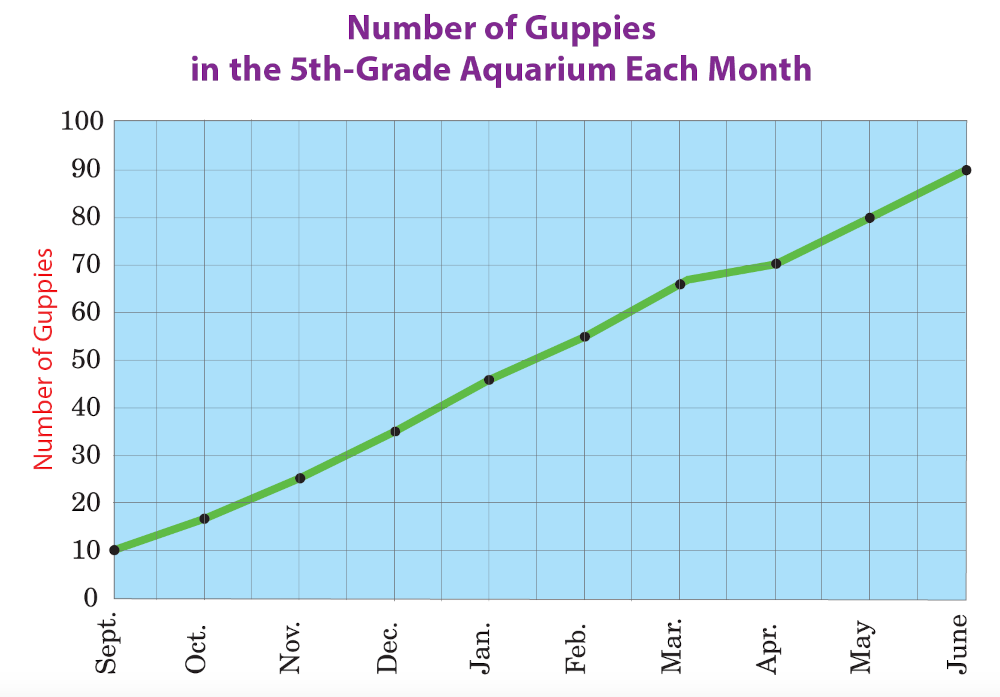
Note Sometimes a line graph has dots or points on the line to make it easier to read. (See the graph above.) Other times, the line has no markings on it, and you must picture the points in your mind’s eye.
WE 336
Page 336
Pie Graph 🟪 A pie graph shows how each part of something compares to the other parts and to the whole “pie.” The graph below shows what part (or percentage) of the total number of guppies is contained in each grade’s aquarium. For example, if there were 100 guppies in the whole school, the 5th-grade class would have 62 guppies, because 62% of 100 is 62.

Quick Guide to Graphs
- Every graph has a subject—just like a paragraph.
- A bar graph compares things at the same time.
- A line graph tells you how things change over time.
- A pie graph shows how the parts of something compare to one another and to the whole.
- Some graphs repeat information you already read somewhere on the page; other graphs tell you more about a topic.
WE 337
Page 337
Tables
Like diagrams and graphs, tables share information in “picture” form. Tables have rows (going across) and columns (going down). Rows show one kind of information, while columns show another kind of information.
Schedule 🟪 The table below is a bus schedule. The rows show days of the week; the columns show times of day. A check mark means a bus leaves on that day, at that time.
Bus Departures |
8 a.m. |
Noon |
4–6 p.m. |
Mon.–Fri. |
✓ |
✓ |
✓ |
Saturday |
✓ |
✓ |
|
Sunday |
✓ |
||
Holidays |
✓ |
✓ |
✓ |
Distance Table 🟪 Another common kind of table is a distance or mileage table. To read a distance table, find the place you’re starting from. Then find the place you’re going to in the opposite part of the table. Finally, look at the number where the row and the column meet—that’s how far it is from one place to the other.
Can you use this table to figure out how many miles it is from New York to Seattle? (The answer is shown below the table.)
Distance in Miles |
Los Angeles |
Seattle |
Baltimore |
Los Angeles |
0 |
1,141 |
2,701 |
New York |
2,787 |
2,912 |
197 |
Tampa |
2,591 |
3,096 |
997 |
(New York to Seattle is 2,912 miles.)
WE 338
Page 338
Conversion Table 🟪 Conversion tables help you convert (change) information from one form to another. The chart below shows certain American measurements that have been converted into other American and metric measurements.
AMERICAN |
|
METRIC |
1 inch |
1/12 of a foot |
2.54 centimeters |
1 foot |
12 inches |
0.3048 meter |
1 yard |
3 feet |
0.9144 meter |
1 pint |
2 cups |
0.4732 liter |
1 quart |
2 pints |
0.9463 liter |
Custom-Made Tables 🟪 You can make your own table to show any kind of information you choose. Imagine that for your science project you need to guess the weight of certain animals or people, and then weigh them to find out how well you guessed. You could make a table like the one below.
Things
|
Guessed weight |
Actual
|
Difference
|
my hamster |
1 pound |
7 ounces |
+9 ounces |
my cat |
5 pounds |
8 pounds |
–3 pounds |
my dog |
50 pounds |
68 pounds |
–18 pounds |
my friend |
100 pounds |
75 pounds |
+25 pounds |
my mom |
150 pounds |
118 pounds |
+32 pounds |
me |
90 pounds |
75 pounds |
+15 pounds |
WE 339
Page 339
Reading Graphic Information
When you look at a graphic, you want to first see the big picture. That means that you will want to know what the topic is, what the graphic is saying, and whether the information adds something new or is just there to clarify. Here are some guidelines you can use when you are trying to read graphics.
Quick Guide to Reading Graphics
- First, look at the graphic as a whole and try to get the big picture.
- Next, read the title, labels, and headings to get a better idea of what the graphic is about.
- Read what it says inside the graphic and look for important information.
- Read the “key” or any special notes included with the graphic.
- Finally, read the paragraph above or below the graphic to gather more information.
Reading Graphics in Advertisements
Graphics that are used to promote or advertise a product or idea require special attention. Sometimes these ads purposely leave information out or tilt things to convince you. This is common in both political and product ads.
Here are some questions you can ask:
- What is the purpose of the graphic?
- What does the graphic tell me (or not tell me)?
- What is the source of the information? Is it reliable?
- Are any parts of the graphic misleading?
- Overall, how trustworthy is the graphic?
WE 340
Page 340
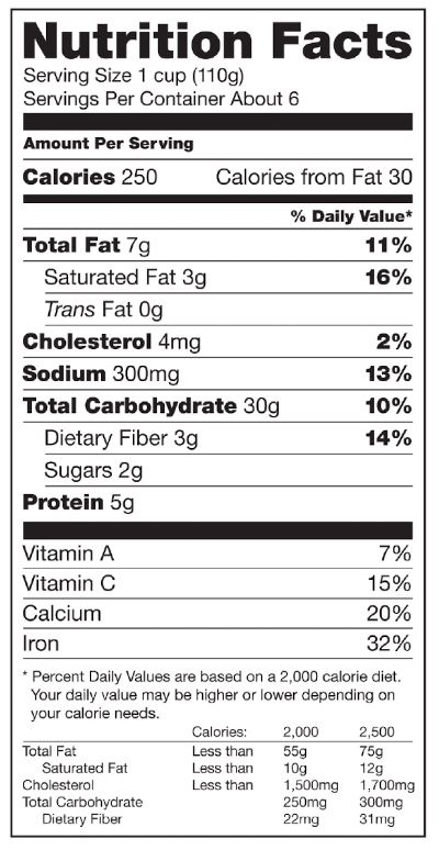
Reading Product Labels
As you know, many of the food products you buy have a special label listing the “Nutrition Facts” for a serving of their product. If you read the labels closely, you can pick up important information that can help you purchase the product that’s right for you.
Look at the “Nutrition Facts” for milk. Can you find an answer to each of the following questions?
- How many calories are in each serving?
- How much fat does each serving contain?
- What percentage of your daily need of calcium is included?
- How much protein is contained in each serving?
Express Yourself
Be on the lookout for questionable graphics in everything you read or see on television or the Internet. Use the questions on the previous page as a helpful guide.