Minilesson Print
Creating Pie Graphs

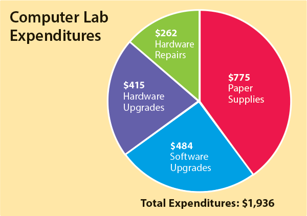
When you want to compare the parts of something to the whole, you can use a pie graph. This pie graph shows the amount of money that a school spent in one year on its computer lab. The total amount was $1,936, and the greatest cost was paper supplies.
Your Turn Create a pie graph by hand.
- Imagine that you have 30 students in your class and you poll them about their favorite pet type. Here are the results:
- Divide the number for each favorite pet type by the total number of students and multiply by 100 to get a percentage. Round anything after the decimal.
- Multiply each favorite pet percentage by 3.6 to get the number of degrees.
- Use a compass to draw a circle.
- Draw a line from the top of the circle to the center.
- Set a protractor on the line and measure to the right the number of degrees for the largest group.
- Make a second line to mark the pie slice.
- Set the protractor on this line and measure and mark the next largest pie slice.
- Keep going from largest to smallest pie slice until you have completed the circle.
- Label each pie slice with the pet type and percentage.
- Give your pie graph a descriptive title.
Dog | 10 |
Cat | 6 |
Bird | 5 |
Fish | 3 |
Reptile | 3 |
Rodent | 3 |
Your Turn Create a pie graph by using a spreadsheet.
- Copy the data from the table above into a spreadsheet program, such as Google Sheets.
- Find the spreadsheet function that lets you create a graph. (In Google Sheets, select the data, go to "Insert" and "Chart" and choose the pie graph.)
- Compare your digital pie graph with your handmade one. How similar are they?

Creating Pie Graphs by Thoughtful Learning is licensed under a Creative Commons Attribution-NonCommercial-ShareAlike 4.0 International License.
Based on a work at k12.thoughtfullearning.com/minilesson/creating-pie-graphs.